About Me

Chesterfield, Derbyshire, United Kingdom
Ashley Renshaw, 19 Year Old Graphics and Interactive Student.

Sunday, 26 January 2014

After leaving College?


After leaving college I've found myself in a rutt. Its nearly been around 8-9 months since we left I think I am unsure about that:/ Well I planned to go to university whilst I was at college however that didn't go to plan. My loan was cut down to the minimum which wouldn't allow me to even live down at my chosen university. This made back out and now I'm working in Retail selling tech. Which I enjoy! 

If you know me who understand who I am you know I love anything design and media related. Its coming to the end of the first month of the new year. I haven't been lazy as I've been working on pushing my video skills. I started airsoft around 3-4 months ago now and regularly record and edit footage. So all is not lost. Anyway peace out, hope I keep this up unlike my last post. Enjoy my latest video.


Saturday, 24 August 2013

Not blogged in a while.

Since leaving college I haven't really blogged much?! So I'm going to be using this blog in correspondence with my website. On my website there is a hyperlink to this very blog!
I will be updating my blog every couple of days with design work, ideas, sketch and anything rather interesting I find.

Currently I am working on a project called 'The Media Life' a media based website with a friendly user face and eye catching design. The project is not only by myself but one of my best friends matt. Who will be designing the back end and CSS to the site.

More to come!

Friday, 21 June 2013

Exhibition


 Today is the day that my exhibition 20th June 2013. I feel my exhibition shows my strengths when it comes to design and that the pieces I have chosen represent myself well. All of my work is vector based  and the reason I have chosen this style is that I personally think that this is my strongest area of design.

Also with my exhibition going up I have received my FMP grade of a merit which I am happy with also.

Here below is my exhibition stand and a few pictures of how it currently looks:


Most Appreciated in Chesterfield


On the portfolio site one of my design as got to the top of the most appreciated page coming at number one throughout chesterfield. Rather happy with this picture is shown below.


Wednesday, 19 June 2013

Paint's and Graffiti Art!


Graffiti paint work has been something I have always been interested in from a very young age I dont mean the small little tags with peoples name you see in and around the city area I mean the really works of art. Which take time and effort to create. I visited an abounded warehouse somewhere in sheffield yesterday to see some nice art work and take some photos. Also to skate around but thats not important here.


On first arrival the place can look very intimidating, scary and rather creepy. Apart from the usual skater at the make shift skatepark around the corner there's nothing to worry about. Near the so called 'ghetto skatepark' there is a huge design from a local named Kid Acne. The design seems to be painted using spray cans and stencils. I've spray paint before and it is not an easy task sometimes it takes skill. The paint on the wall had a nice feel to it it was as sort of matte felling similar to the one when you redecorate a room. Whether this was a cheep alternative to spray paint I wont know.


Some of the designs around the other side of the building. Bright colours with a sharp stroke was a common theme throughout the graffiti.  


This designs is from a video game 'Slender' it features the main character in which is meant to be a horror or shock game. It was a surprise seeing this here. 

The most common spray paint used I have found is montana gold. A popular spary paint company from america and is sold in most art shops in your local area. The prices range and from a personal experience range from £6-8. They come in a ray of colours including some matte colours which are also great for painting on canvas etc. 

Tuesday, 18 June 2013

Camera's and Equipment.


There are a variety of different cameras from bridge to DLSR. Most of the cameras are really expensive however you can pick a cheep bridge camera up for around £99 at most tech shops.

 DSLR cameras are the perfect camera to work with in my opinion they're the most professional and the most customizable cameras. They're normally larger then any pocket or hand held camera. The most common reason someone would be a DSLR is for the feature of being able to change the lens unlike bridge cameras. Changing the lens to fit a different setting or situation. DLSR will always have a better picture quality compared to compact cameras if used correctly. The reason for this is that DLSR more then always have a bigger image sensor size therefore creating better images. With a DSLR its easy as one two three. You can set the camera to auto and start snapping straight away however if you want to get a bit more fancy you can set it to manual and have a play around with aperture and shutter speeds.

Digital compact cameras which are also known as point and shoot cameras vary in style and size. One main appeal from buying a compact camera is the size and the feature of being able to take photos as soon as the camera is taken from the box. A common compact camera will have around 3x zoom and 12 megapixals. Today's digital compact cameras come with a fully automatic mode in which you just point and shoot!

Bridge cameras also known as advanced compact cameras. The main difference from a bridge camera and a compact camera is that bridge allows the photographer to have more freedom with the camera and allow the camera to change things such as Aerture, Priority, shutter speed and program modes. 
Many bridge cameras have a lens that has a big zoom on for example like 30x compared to a compacts 3x zoom. The Lens on a bridge camera is a fixed lens which means it can not be taken off or replaced with a different one unlike the DLSR. Also most bridge cameras will have a small image sensor but mange to still take high quality photos.

Overall out of the three I think that a DLSR Camera is better however you will be paying more but the advantage of being able to replace len's for different activates and areas is the winner for myself.

Monday, 17 June 2013

The Pirate Bay AFK.


TPB: AFK a documentary following the founders and creators from the well known torrent site 'The Pirate Bay' and there struggle with a legal battle with hollywood.
Directed by Simon Klose featuring: Peter Sunde, Fredrik Neij and Gottfrid Svarthom.

Filmed from 2008 up till the final trails in 25 February 2012.

The film follows the trails and the every day drama from hosting the worlds leading bit torrent pvp site. This site is still running to this day with every participant serving a jail sentence there a few members from TPB who still run the site and in Peter Sunde's words 'We will never loose the pirate bay.'

The film is all in subtitles and i must say it has been one of the only films i have every watched in subtitles and enjoyed. The film is spoken in Swedish with English subtitles. The film starts out in a rather strange way, it feels like a hollywood film. The shots, the editing and the soundtrack all are very familiar to hollywood blockbusters with small little puns such as '13:37' on the clock which I thought was a very generic internet term to add to the film i found it rather funny.
Following the realise of the film big companies such as: parment, fox, lionsgate all went to redirect goolgle searches for the film.

The art work is what first brought me to the film. The vector style design is really iconic once watched the film as the servers you can see on the artwork represent the film's moral and what behind all the drama what pirate bay really is. Wires, cables and admins. The colour scheme really stands out the bold white text stands out from the background with a contrast from the green. The greens and blacks flow throughout the art work and gives a sense of mystery and secretive feel.


Sunday, 16 June 2013

Jon Contino - Stephen King


I've been in contact with Coniton various time and was lucky enough to have him take a look at my work which was a great experience, all possible through social media which is fantastic! Following his work for a while now I am very familiar with his style and this stephen king book cover design really caught my eye recently.

After the current book cover design project I couldn't have found this design quicker. Three days after finishing my FMP I discovered this excellent example of a book cover design.

The main element of the design I was so drawn to is the typography. Contino has a great eye for type and it shows throughout his work the sans serif type stands out based on the fact it warps around in an arc form.

The colour theory is excellent and matches the style great, the use of a sinister red and the light purple background does not clash at all. The main design has some sort of texture on the book which is something I complimented when designing my own books.

The overall design from the book is great. Very striking and gives a sense of mystery as well as the sinister feel created by the dark red and the over dramatic curling trees which seems to be very iconic when It comes down to horror stories or films.

I think when it comes down to overall design you really need to feel and have the book to be infront of you. I can tell from the photo that the book is printed on some style of 280+gsm it looks to be some form of hard back book.

.


Friday, 14 June 2013

No Peace America


I recently watched a really inspiring graffiti video, graffiti is illegal however its always been something I love looking at and the the vibrant colours and artist flare which comes along with most street art is incredible.
The video was called 'No peace America' I'll leave a link down below as blogger doesn't support Vimeo links.

The video is basically a group of street artist tearing up the subway in america. Breaking into subway stations to get there name or tag out there. Although myself personally don't condone graffiti I think its a beautiful way for a person to express there self if approached in the correct manner. The shots in this small film are brilliant the sheer excitement from see a 200mph subway train flying past the artist is crazy. 
Some of the bigger tags and pieces are shown to the end of the video and this is where really you can see the artistic talent that is put into every design, with this said please check the video out if you have a spare 5-10 minutes.


J Monster Art – Custom Illustration and Design.


There isn’t allot of information about J Monsters work apart from his facebook page in which he sells prints and custom designs. With a smaller following of 800 he is more unknown then most artist I research.

It is obvious from the start that monster works in photoshop as the screenshots and small progressive images that he post’s on his page. I have been in contact with him various times to ask about brush strokes and brush sizes.


As shown here the brush settings in which he uses’s in photoshop during his work. Unlike most artist I have research he doesn’t work in photomanipulation however he uses characters from games and random drawings to create his work so in a way he does use photomanipulation.

I really like the style of photoshop he uses sharp straight lines with stroke. It becomes familiar that his style is a really sinister style of drawing. The use of colour and shading adds to the aroma of he the orginal design.
I would not be able to add this style of work to my unit however would have been a great alterative if I was to choose a different style.

Thursday, 13 June 2013

Don't erase!

I found this interesting video and the official Facebook page 'Adobe Photoshop' It goes on to explain that I'f you've ever used the erase tool in photoshop that you're doing it wrong and that every edit should be easily undone when using photoshop! The video goes on to show us viewers how to use the mask tool correctly and to replace the eraser tool. Take a look!


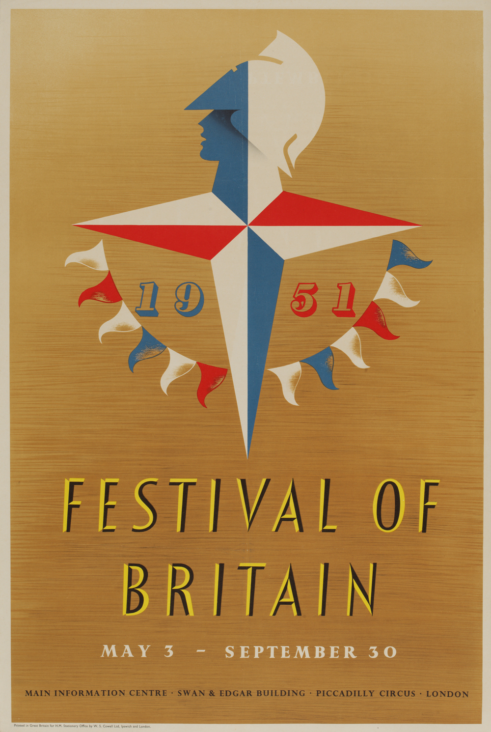
Festival of Britain


The Festival of Britain was a nationwide exhibition held in the United Kingdom in around 1951. The government organized this event so that use people of Britain could recover from the war earlier that year not also to help the people of Britain but to showcase and promote the British contribution to science, tech, design, architecture and the arts.


The festival was held in London, UK. And was on the south bank of the river Thames. The event was a great success, not only was the event held in London but various cities throughout England held celebrations also. The festival later became associated with the post war labour government of clement atlle.


This poster design was an advertisement for the event. I love the early style of type, it reminds me of hand rendered type. The use of colour is also really great for its time. The two contrasting colours really make the letting stand out from the background. The small illustration in the centre is a really detailed image once you look closer. The early use of drop shadow on the face made me really think about how this was created during 1951.


Wednesday, 12 June 2013

Disability awareness - Ending Intro

In order to gain the full money for the live project we had to finish the whole videos off by adding an extra bit at the end of every video. 

I said to my group that It would be no problem for myself to add the extra bit.
I went ahead and used my professional blu snowball microphone to record an audio clip lasting no longer then a couple of seconds. I emailed back and forth with jamie to get the correct wording he wanted us to use on the clip. 


Using sony vegas which I edited the video in a I recorded the sound show below in the screen shot. As you can see the audio was faded in and faded out. Using some SFX I was able to make my audio sound even more crisper. Before recoding I attached a 'Pop' Filter' to my microphone to eliminate any popping sounds.


After production was over I was finally able to render the full project and hand the project back to jamie to give to the client.

Alex Persani - Photo manipulation


Alex Persani. Photo manipulation, retouching and general graphic design.

Persani’s work is a wide range of photoshop based skills his strongest point has to be image manipulation this is obvious as the majority of his projects are in this style. 
He seems to use a vector mask in his work more then any other effect or technique using this he will blend the images together with a circle and a feather of 20% this would allow the images to bleed together correctly.

Matching colours is something he is very graphically strong with. Using hue and saturation to gather the right feel for the two images and making sure that the images are correctly blended together.
His techniques for manipulation are very similar to the techniques you could use for retouching photos or even photo editing in general. 

Shown by the photo below using such tools and adjustments layers, high pass filters and redefine edged tools to make an image look brand new. Sometimes referred to as ‘Photoshopping’ the model or object.

Use of vector mask’s is something that I have used in my own project when creating backdrops and image’s inside of text. It is clear shown in this image left that alex does implement the use of vectors masks heavily in his work.

Tuesday, 11 June 2013

Fast and Furious 6.

After watching most of the fast and furious series religiously for over three years now it seemed okay to go and see the 6th film. This small write up will be my thoughts of the film and and why I dislike or like the film.
Bare in mind that I saw the film last month I think its only fair that I do this write up sooner then later.

One main thing that I noticed throughout the whole film was the product placement around which slightly annoyed me. Its fine for car makes especially in tokyo drift. However such drink and food brands as:
Disarano, NOS Energy, Corona beer and some for as crisp possibly walkers. It annoyed me as it was very clear to me that they had been put there on purpose for us as viewers to see.

Something In the film that I really enjoyed was the soundtrack and the shots which were used. I gather that most of the actions scenes would have been CGI however the low angled shots and the intense fast paced close ups gave the film a really action sense. One action scene stood out the most for me and this was how far the runway went on in the final scene. Image shown below explains.


Overall I think that the film is a must watch for any fast and furious fan however watch out for product placement. If the producers would had taken the product placement out of the film I would have been more impressed however the film itself was fantastic. Shots, music and storyline was great.

Every Mac ever illustrated!


I found this nice article on creaticebloq website showing you every mac ever made illustrated by a simplistic designer Akash Doshi. As a fan of simplistic work this really stood out for me and thought it would be great to add to my contextual influences!

'Macs have changed quite a bit over the years. Illustrator Aakash Doshi aims to depict every single design with this simple and colourful series'


Wednesday, 5 June 2013

Screen Printing.


Screen printing is something that I have been interested in since year one of my interactive course. Screen printing is away of printing that uses of mesh type material to print onto in this case clothing. The ink from the woven mesh is printed onto the desired material. The process is the same as using a stencil to spray paint things. The ink is forced into the areas where the design is and creates the design onto the desired product.


I was first introduced to screen print thought social networking sites such as facebook. At one point I was considering create my own designs on a few tshirts for personal use however screen printing is rather expensive. The company I get in touch was are called blue bird press. They're a screen printing and graphic design company from Kent, UK. They offer prints at an price. However from every product I have seen from the company they have all been high quality.


This technique is something I was to peruse later at university. I think that It would be a great skill to have and and excellent technique to use for experiments and final products. Sometime in the future I may even order some of my own designs on tshirts from this company.

Monday, 3 June 2013

Digital Painting In Photoshop.

I was first introduced to digital painting from an online graphics community I am apart off. One designer initial showed be the correct brush settings which come in handy once painting digitally. Another tool that helps allot once painting in photoshop is a tablet, I prefer to use a Wacom Bamboo Tablet with styles.

I started out drawing the lines in illustrator this was just because I felt more comfortable editing paths and strokes inside illustrator.  After this is complete photoshop was open and it was time to start painting.

Setting your brush so that when you add pressure the lines or colour becomes more darker and vice versa, pushing slightly down will give you a lighter stroke and a less harsh colour.


 The settings above are what I tend to use when applying this technique.


Once you've found or drawn the person or thing you should end up with a result some what like this. Created using strokes and lines. It's now time to layer colours on using the settings we have set already.
Choosing a tone or shade using the colour picker or a hex code you already know.

As you can see from the image below digital painting in Photoshop takes hours I think I've worked on this image for around 2 hours trying to get the correct shading and and the tones right. Manipulating images in photoshop can be hard and has great outcomes once finished I am going to continue and work on this style throughout my time at college.

Saturday, 1 June 2013

Art Deco Minimalism design


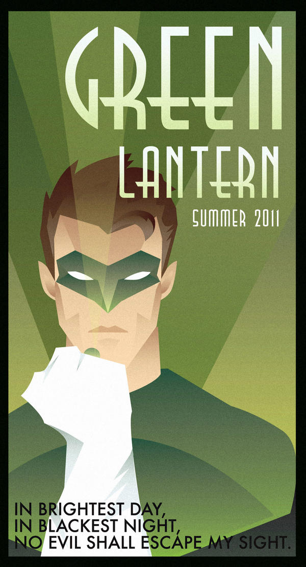
The art deco style is something that as a simplistic designer is great! The flat colour lines and the vibrant visual's are great. I personally love this style of art. Whilst research this style I found a designer 'Rodolforever' a rather unknown designer but a very talented person. Most of his work is this flat colour art deco style. Using illustrator this is all possible.

Some examples of his work and my thoughts about each one:


This design is the first one I found on his page. Its the popular hero 'Green Lantern' something that really stood out about this design was the use of green hence the character green lantern. The typeface is really unique and I think fits the style great!


The second image of superman again the use of the same type face for the bottom is identical however the top text has been outlined. I really like that the silhouette feel to this design. Gradient use fits the colour great. It seems that the design has a texture overlaid on the image but very suttle.


The Third design a batman classic. The use of colour theory and the colour flows throughout the design from the gradient back to the text used down the side. I really like the outlined skyline in this design something I have used before on simplistic designs.