Here you can see my life drawing images I have created 3 A1 Size paper sheets with drawings of a clothed male model, the time spent standing up was not great as after 30 mins i started to ache. I enjoyed the drawing body and shape much more then drawing hands and feet, as the outline/figure of the shape was very enjoyable to draw, and using the charcole to draw with was great. Using my fingers to apply shadding to areas which would be darker and charcole to wear down the edge to create a point for more define areas.
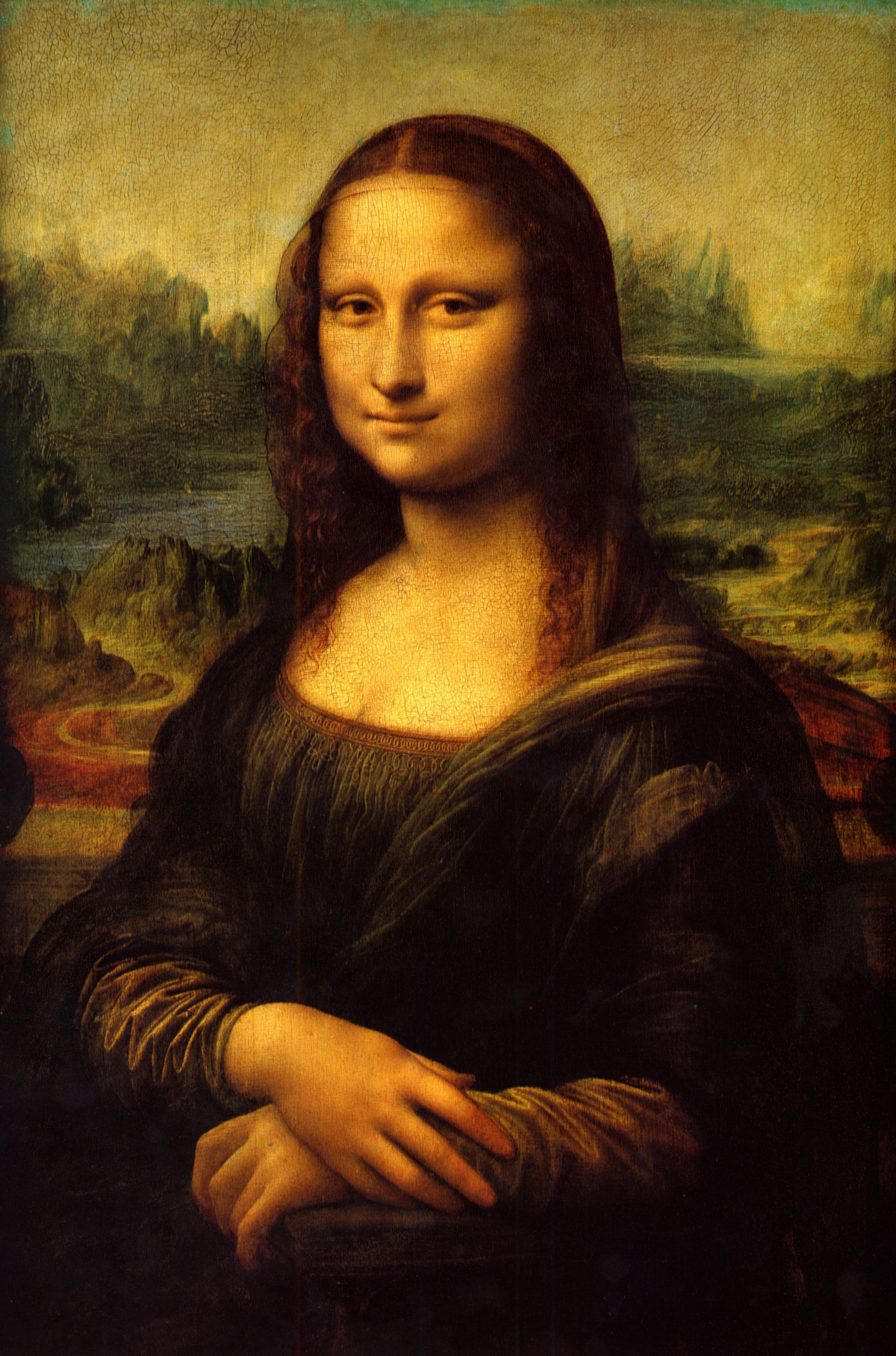
Leonardo Da Vnci Da=from Vinci meaning Ferenze which is in Italy, i have been asked to look into this famous artist and the way he conducts his work. We are studying life drawing and LDV was a keen life drawer, however did not finish all of his work in some case's. His life drawing's mainly were his assistants or people which we help the artist out, in this case sometimes they were is partners or people his was keen off. LDV is properly most known from his amazing art work and one in particular, The Mona Lise. Mona Lisa del Gioconda being her correct name, Mona Lisa was the wife of Francesco di Bartolommeo di Zanobi del Giocondo. It had taken him 4 years to complete and is only 77 x 53cm wide/long, most people including myself thinking the painting was larger
One of my first page in my sketch book i tried to use a small page which i had preped prier to this lesson, using charcole, to draw the feet this was a task ad my hand would smudge the charcole as i moved up the page, i overcame this by using hairspray to spary the page and create a a soild colour, however made the page shiny.
Drawing hands and feet were very dificult and getting the puportion and the shape of the feet were difficult, i found drawing feet you hand to using your figures to make the image less sharp, and have a smoother feel to it just like the natural curve of a human foot.
As seen here, i have been shown/used line to represent were the life model is how tall and how small he might be using each line to guide myself to getting the correct size and proportion, this worked well as i can find were his features were to go weather then just hand drawing the life model and him look odd.
Here is the second page in my sketch book i have again used the time we were given to prep my pages to create an intresting sketchbook, on the first page i have used some of the techniques which ben nicolson has done, for example the M on the bottom of the page i have tried to shade a smooth out the inner M to create shade much like Ben has done on the images below i think, that this gives the image a nice feel to it and a better perspective to the image. drawing shapes, or objects i found easyer then drawing the human body.
This is some paper in which i had laid down, so i did not create a mess on the table, however turned into a practice area for my glass, i had chosen the glass beacuse i think it was the most intresting product which i was given, i was advised to to practive my oval's and this is how i came about creating the glass practicing oval's and curves.
Ben Nicholson
Ben Nicholson is one of the artist in which we were to look at for our life drawing class's.
 His art work is very abstract and some say influenced British art forever. He is most commonly known for his geometric paintings, It was not a great surprise that he was to become an artist as his parents were budding artist's also.
He was born in 1984 in Denham, Buckingshire.
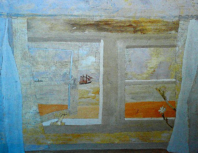
The Image shown above is a view from, Cornwall window I like his use's of simple colour here and the way in which the whole image has been put to gather there is a different perspective, it looks slightly 3D using slight white shadding.
 I like his style of a work as it is very abstract and he use's a wide range or colours, her is an example of my work were i have used some of the same techniques, such as layering as you can see in my image i have layerd most of the materials which i have used to build up on this will create an intresting texture when i go to print using the print making area which we have been demostrated today.
Here is my print, i have used various techniques in this image, to create a nice printing area. The life model in the image was drawn using the charcole, then layered with diffrent materials and ideas for example i have cut out various parts of the image to create depth light and dark areas. I have PVA the
His work can go for anything from, £ 3,500.00 to £ 1,500.00.
Here I like the use of shadding and his mark making techniques, the collage effect of a table and the view through the window again located in cornwall, his shadding on the botton of the table looks like it used with charcole and we can relate to the shadding teachniques, by using this to shade various parts of the life models.
JET JAMES
Jet james, a collagraph artist lived and born in Australlia perth. He has become very reconisable for his abstarct art work, his mother and farther were both budding artist and had some great contacts with the big names in the music industry such as 'Jimi Hendrix' and more. I like his style of a work as it is very abstract and he use's a wide range or colours, her is an example of my work were i have used some of the same techniques, such as layering as you can see in my image i have layerd most of the materials which i have used to build up on this will create an intresting texture when i go to print using the print making area which we have been demostrated today.
One of the techniques which i would like to use, is ceating an outline in card and rubbinf inks, and colours into for example here is a picture shown below of James doing the same teachnique.
Here is my print, i have used various techniques in this image, to create a nice printing area. The life model in the image was drawn using the charcole, then layered with diffrent materials and ideas for example i have cut out various parts of the image to create depth light and dark areas. I have PVA the
area to make the card very hard, therefore would be very hard and durable during the procces of printing.
Terry frost was a massive part of the British absrtact art era He as born in Leamington in 1915 and left school at 14 to work in a buke shop intill the outbreak of the war. He served in countries as diverse as Palestine and Greece, before being captured in 1941.
He began painting and drawing at a very young age.His work can go for anything from, £ 3,500.00 to £ 1,500.00.
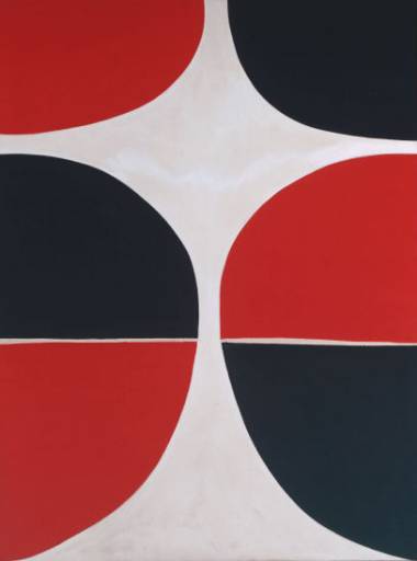
His work, is very creative and he use great colours that stand out, i think this is the reason his work stands out from the other artist.
Here is one of his creations, i like his use of colour and the symmetrical patterns.
His prints look very artificial, they all like like modern computer made prints by useing such programs as
photoshop or illustrator,
Barbara Rea.
Barbara Rea

 Barbra rea's work is a mix of spain's sunset scenery, her insperations come from allot of landscape work, as she loves to travel. Personaly i think that her images are very contrasting for example the the clours pink and yellow contrast, i like her style as the image creates a feel and a diffrent mood which many of the artist i look at dont create. She has spent most of her student life printmaking giving her the skills and know how, to be able to create such great work is the ones provided below, resulting in here work selling for such prices as £ 1,150.00 to £ 400.00. I think that her works shows just how succseeful printmaking can be, and if you use the right technique that you can get great results.
 I like the image to my right as the warm colours which she use's knowing that most of the prints are based on landscape from spain, i can know understand how and why she has used the warm feeling colours she has.
Red's and Orange's to display the horizan and sunset and the cold blue to simulate water.
Dawn Cole
Dawn cole is a uk based artist, liveing and working on the north cost.
Dawn produce's a strong looking image print with a great deal of texture and contrast, i have seen quite allot of Dawns work in black and white (monochrome). She use's great detail which i think works very well there are spirls and swirls which bring out a strong looking pattern and sometimes, you dont get the full perspective of the art intill you have looked at it for some time.
After seeing some of her most recent prints/ plates, i can now see the technique she use's allot of time and care goes into her prints, and i would like to apply the mesh looking patterns which bring a great feel to a print .

 I particually like this print/plate i am unsure wether this is the plate or the print as you cannont really tell however the use of rope reminds me of an art deco style. The use of line and shape brings a great looking piece, i would like to apply this to make work be adding more detail in the areas which i personaly think need a distinktive pattern for exmaple the life models head or clothes, i think that this would work very well when i go to apply this to me print.
Cy Twombly
Cy Twombly mainly use's large scale paintings and prints some of his most succseful art work in my opinoun are created with his paints and the distinkt use of flat colour for example: 

This image my look like lots of scirbbles on a page however when you truley see what the image is about you can tel that he hes taken his time and care to make each stroke indavidually diffrent, however simple his work my be and some people smay say that the image/ his work will be easy to recraate or create in the same way, must have the skills and simmlar tecniques to do so. beacuse it will not be easy unlike most people think.
I would like to add the large scale of colour used possibly to my own print by using the print room to create on high quality one colour print in this style using the paint/ink in certain areas rather then just rolling it on images.


